


UNITED & FREE
_
Brand Strategy, Branding, Campaign Strategy, Packaging Design, Art Direction, Product Development Consulting,
Video Art Direction, Photoshoot Production, Logo Design, Copywriting, Set Design, Props & Styling
Video Art Direction, Photoshoot Production, Logo Design, Copywriting, Set Design, Props & Styling
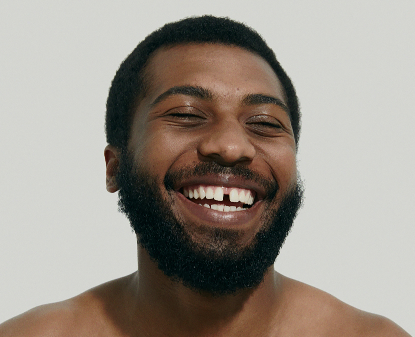
Hair and skincare for all bodies.
For the earth.
For the ocean.
For the ocean.
We co-created a body and hair care brand intending to eliminate the amount of packaging in your bathroom by making multi-purpose products that offer three solutions.


We created a custom typographic monogram to emote union and individuality. The wordmark is typeset in GT Sectra, inspired by the human touch of hand-formed calligraphy.

Waste inspired brand packaging — our climate positive design process involves countless hours of research to source materials which are created from the earth and can go back into the earth. For every 10 tonnes of sugarcane crushed, a sugar factory produces nearly 3 tonnes of bagasse waste. Made from that waste stream, we created an outer shell to protect the balm on-shelf and during shipping. The custom form of the outer packaging outlines the curvature of the vessel held within, a metaphor for transparency that is foundational to United & Free’s values. The bagasse packaging can be composted after the package is opened, closing the loop. The bottle revealed inside, flooded in the brand’s signature blue, is glass which is made from sand. It’s 100% recyclable. The lid is made from 50% post-consumer recycled plastic.


Closing the circle—plant cellulose combs made from wood pulp and acetic acid derived from vinegar. The blue flecked comb, debossed with the United & Free monogram, will biodegrade under the correct conditions.
The comb is packed in an FSC-certified 100% recycled paper stock pouch with blind debossed details. We created a custom dieline with a curved flap that echoes the shape of the comb held within. The pouch can be used to store the comb, or easily recycled in regular recycling streams.

We envision a future where we don’t need to choose between our body’s needs and the Earth’s needs.
The United & Free brand is built on the idea that to make change you must first be change. You must self explore and self educate to grow. Then, once free from what holds you back, united with your values and action, you are in a position to unite fully with others, to support them in their journey of growth. Together, eyes open, looking forward to the greater change that humanity calls upon us now.
This is the Super Future.


The study of human and land. Nothing exists alone—earth connects all. We exist together. Thrive together. This is a journey united. It includes us all. It is imperfect, but vital. We envision an inclusive world — where expression thrives. Where humans and Earth coexist in unity. This is a mission for a healthier home. This is care for all bodies. You are welcome here.
The horizon is near. The future is inclusive. Sustainable. The future unites.


Our human centric branding process puts the soul purpose of the brand at the centre of all of our design decisions, from monogram, typography to art direction and packaging. A custom typographic monogram created to emote union and individuality.

Brand Strategy, Branding, Campaign Strategy, Packaging Design, Art Direction, Product Development Consulting,
Video Art Direction, Photoshoot Production, Logo Design, Copywriting, Set Design, Props & Styling
@arithmeticcreative
Video Art Direction, Photoshoot Production, Logo Design, Copywriting, Set Design, Props & Styling
@arithmeticcreative
Photography, Gabriel Cabrera
Photograph & Video, Darian Wong
Designed in Vancouver, Canada by arithmetic
Client, United & Free
Do not repost or publish without the consent of Arithmetic Creative Inc.


